A brand new look for Fathom Analytics

Fathom Analytics launched in 2018 as a single-page marketing website and a two-page application. At launch, the dashboard had only a few metrics and lacked filters, search functionality, comparison features, and event tracking.
Even between what we called “Version 3” and this new version, a lot has been added, and a lot will be added soon.
So, our interface had to change to accommodate new and necessary features. We hope you like it! Here is a bit of the reasoning behind the changes:
Version 4 became a journey
Initially, our plan was to release the new version of Fathom and all its features all at once. This would have meant a new interface design and over a dozen new features added simultaneously.
The problem with that plan is that as a tiny team (we’re four people and a handful of contractors), the project was too big to tackle all at once. Worse, it would delay releasing anything for months and months.
So Jack and I had to adjust. We decided (live on air) to break this new version into chunks and release it as each new chunk was finished. That way, our customers would get to use the new things right away and not have to wait until everything was finished.
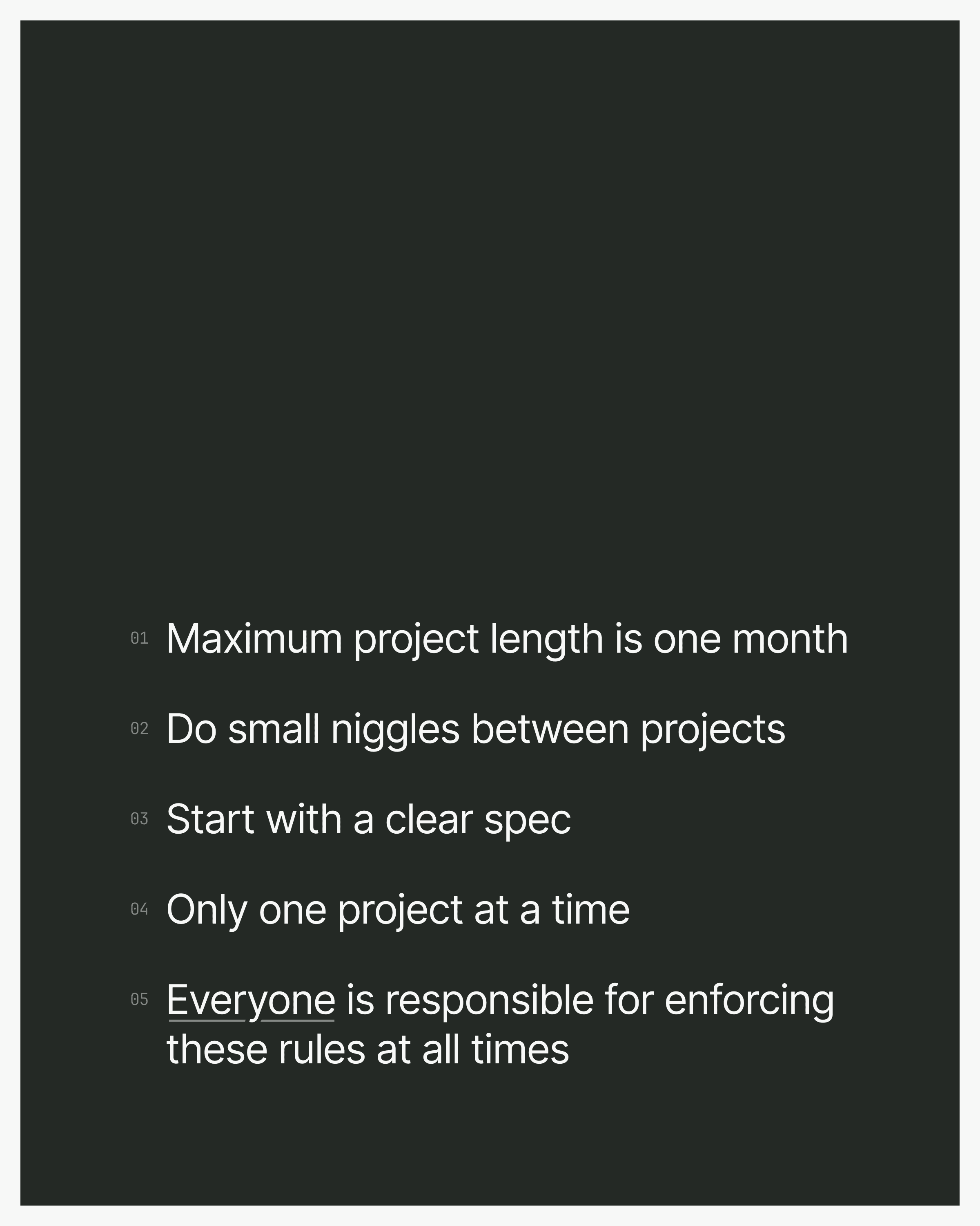
We even designed a poster for ourselves to keep us on track:

This poster is a daily reminder and now hangs above our desks in Jack’s and my office.
The first piece of the V4 puzzle is the interface
Once we knew we would break the too-large project into many smaller projects, we knew the interface was the best place to start. Its layout and design make it easy to add new features as we release them. And some of the interface changes were actually necessary to add some new things too.
I’ve always thought of design, in general, as a way to bring beautiful order to chaos. What I mean by that is that without design, you could end up with a menu with 20 items on it, too much to digest on a single page, or unrelated items beside each other incoherently.
So, when designing, especially for software, I think of every choice made—from colours to size to where things go—as ordering chaos on a page in a way that looks good but more importantly, makes good sense.
The goal of any design or redesign then becomes, “How best can we make this into something that makes the most sense for customers?”. That way, it becomes easy to understand and use and doesn’t provoke a sense of stress (even the first time it’s being used).
The choices we’ve made
The new interface doesn’t look significantly different from the previous version. That’s on purpose. If something didn’t need to look different, then why change it?
Over the last 25 years of my design experience, I’ve seen first-hand what happens when you change everything: even if the new version is “better” in some ways, most people don’t like change, or at least don’t like having to re-learn something they thought they’d already learned. As a customer of software myself, I’ve felt this first-hand as well.
So, the new design isn’t too much different. The only things that have changed (or moved in the interface) are things that absolutely had to change or be moved for future features to make sense.
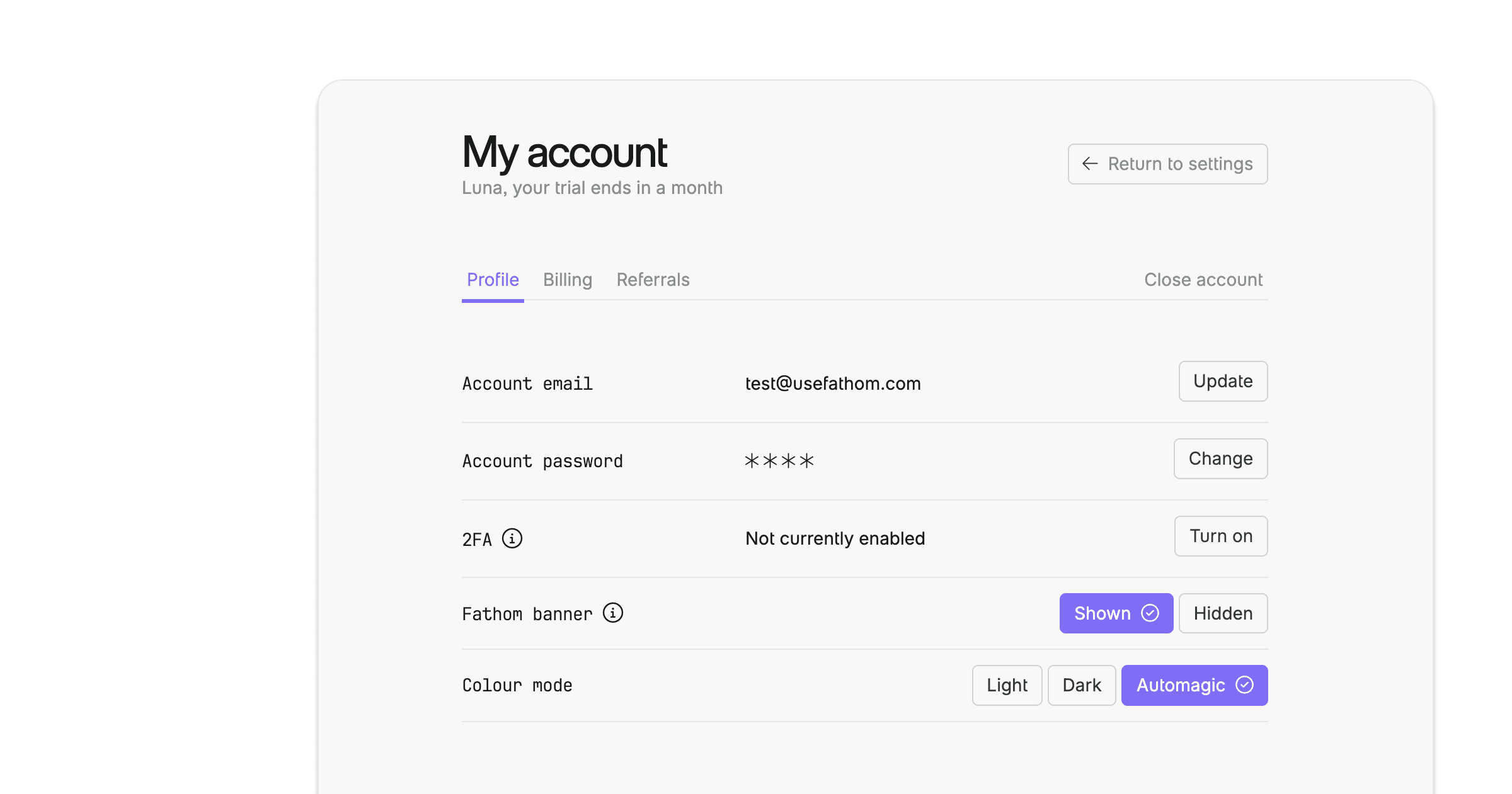
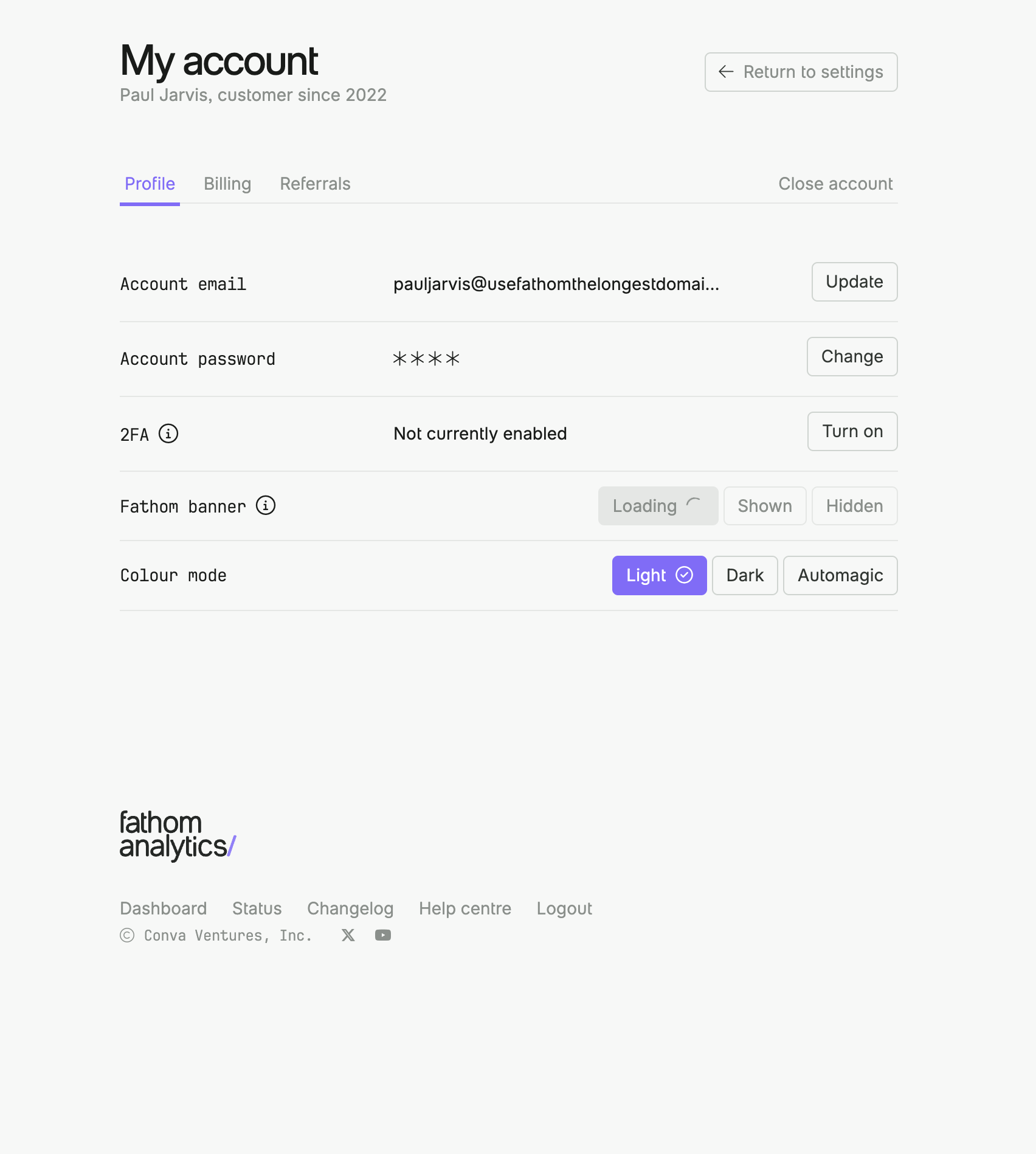
The account section is a case in point. It’s now like a mini section outside of the settings - instead of being a single page in settings.

This was done because we’ve got “Teams” coming out soon, and we very much needed to change how you manage your account (which is just yours) and how you manage the settings of your sites (which could be shared by teammates). These are now two very different and separate tasks. So it wasn’t just “let’s move things around for fun!” It was, “This has to move, but here’s the least annoying way to move it.”
This same mentality applies to everything that’s changed in the new version of the interface: things are different only if they have to be, and then only as minimally different as necessary to achieve their goals.
Under the hood
As a designer of frontend code (HTML/CSS/JS) for several decades, I’ve also built and maintained many frameworks for software and websites. This new version of Fathom is just that: a one-off framework for our brand and our software that makes it easy (and quick) to build new features, designs, pages, and ideas.
The CSS, which we internally call “Skunk,” makes several decisions out of the gate, without any classes. Fewer decisions mean fewer classes are needed for elements to achieve the right look and design. And since this is just a framework for a single brand, we can do that.

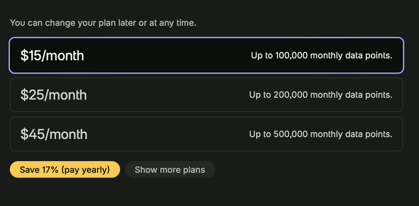
An example of this is our pricing selector. It requires one CSS class pricing to achieve its style. And then, inside pricing, it’s a grid with a few elements:
<div class="pricing">
    <input type="radio" id="100k" name="plans" checked="checked">
    <label for="100k">
      <fa-grid class="grid grid-min-left">
      <h3>$15/month</h3>
      <div class="right">Up to 100,000 monthly pageviews.</div>
      </fa-grid>
    </label>

    <input type="radio" id="200k" name="plans">
    <label for="200k">
      <fa-grid class="grid grid-min-left">
      <h3>$25/month</h3>
      <div class="right">Up to 200,000 monthly pageviews.</div>
      </fa-grid>
    </label>
</div>
This way, if a developer needs to add or change something, they don’t have to make many design decisions. They can focus on making it work, not making it look correct.
The new Fathom framework makes it much easier for me (as the designer) as well to build a new page for a feature. I don’t have to think about what it’ll look like for too long because there are so many interface rules for where things go and what they look like. That makes it so much easier and faster to build things out. And then, for the developers, it is so much easier for them to take my frontend code and turn it into functional software.
The same CSS/HTML framework is used for the application and the marketing site. They share the same base CSS file (fathom.css), with just a few extras added to app.css for the software and site.css for the marketing site.
What’s next
As mentioned above, this is just the first step in Version 4. We’re launching the new interface today and hope you like it.
Next, we’ll be adding many of the new features our customers have been asking for, such as teams, event properties, an out-of-beta API, and more.
Stay tuned.
Jul 4, 2024