
Designing a million dollar brand
news Paul Jarvis · Dec 7, 2020I like to think of Fathom, not as a design-led software company, but as a company that equally weighs design and technical. Which makes sense, right? I’m a designer, Jack (my cofounder) is technical and we’re equal founders. And the reason our partnership works so well is because we share the work and direction of the company equally.
When I first designed the interface for our analytics product it looked nothing like any other analytics product on the market. These days, it seems that all new analytics software has a similar look to their dashboard (this isn’t a dig either, I’m stoked to have created a new visual language for analytics).
That said, I don’t write about design nearly as much as Jack writes about the technical aspects of our company. So let’s change that. In this post, I’m going to share some of my branding techniques that have helped build the leading privacy-first analytics software on the market.
Branding, explained
Fathom has always had a strong, and very custom brand. Sure, there are logo generators and amazing CSS frameworks to use for a software product, but because I’ve honed my skills as a designer for decades, I always like to go with something fully custom and carefully thought out.
While I’ve always spent a lot of time on Fathom’s designs and visuals, prior to recently, I only had time to work on each individual element separately (logo, blog graphics, marketing site, application UI). Hey, it’s a lot of work co-running a software company - so time can sometimes be scarce.
Branding is also not just a logo. Branding is how people connect and feel about a company. This is done through a logo, for sure, but it’s also things like tone of voice in content, how bright or subdued the colours are, emotions evoked by the typography chosen, and the imagery/photos/illustrations used.
Basically, branding is the “vibe” you get from a company when you interact or consume from it. Anything from watching a commercial about it on Youtube, to how you initially feel when you sign up for an account somewhere, even to how you think others perceive you if they know you buy from the company (like wearing a Patagonia vest, for example).
The visual evolution of Fathom
As most of you know, Fathom started out as a mockup. I was sick of Google Analytics one weekend, years ago, and decided to draw what I thought analytics could be. I tweeted it, the tweet went viral, and Fathom was born. As I mentioned, this also birthed a whole new niche of “simple, privacy focused analytics” companies.
And while the initial design was pretty decent, I had never designed an analytics software product before. I knew software design, sure, but I didn’t know design specifically as it related to analytics. Whereas now, I’ve used our product daily for years, and have seen how thousands of customers use it. I’ve listened, I’ve learned, and I’ve worked to continually iterate, so no change is super huge, but each change makes things better and easier for the folks who pay for our software.
![]()
Mountain chart, v1
I created the first version because I wanted some branding on the mockup, so I threw a graph into a circle so I could tweet the mockup out. And “mountain chart” was born… which wasn’t very original, so it was luckily short-lived. This logo died when we launched the first paid version of our product.
North star, v2
The second version of our logo was the “North Star”. This lasted from our initial “PRO”/paid version until November 2020. I created a brand mark that spoke to analytics (the “arrow”), but also something that spoke to having a very specific purple… a north star if you will. Something that guided us in our decision, reasoning, and direction to be an unwavering privacy-first company. Thus our north star from the logo kept us heading in that direction.
The nerdiest of design nerd notes about the north star branding was initially I wanted it to point 15 degrees to the east (which is the magnetic declination of true north from where I live), but 15 degrees didn’t look angled enough, so I tripled it. No one (not even Jack) knew this uber-specific tidbit until now.
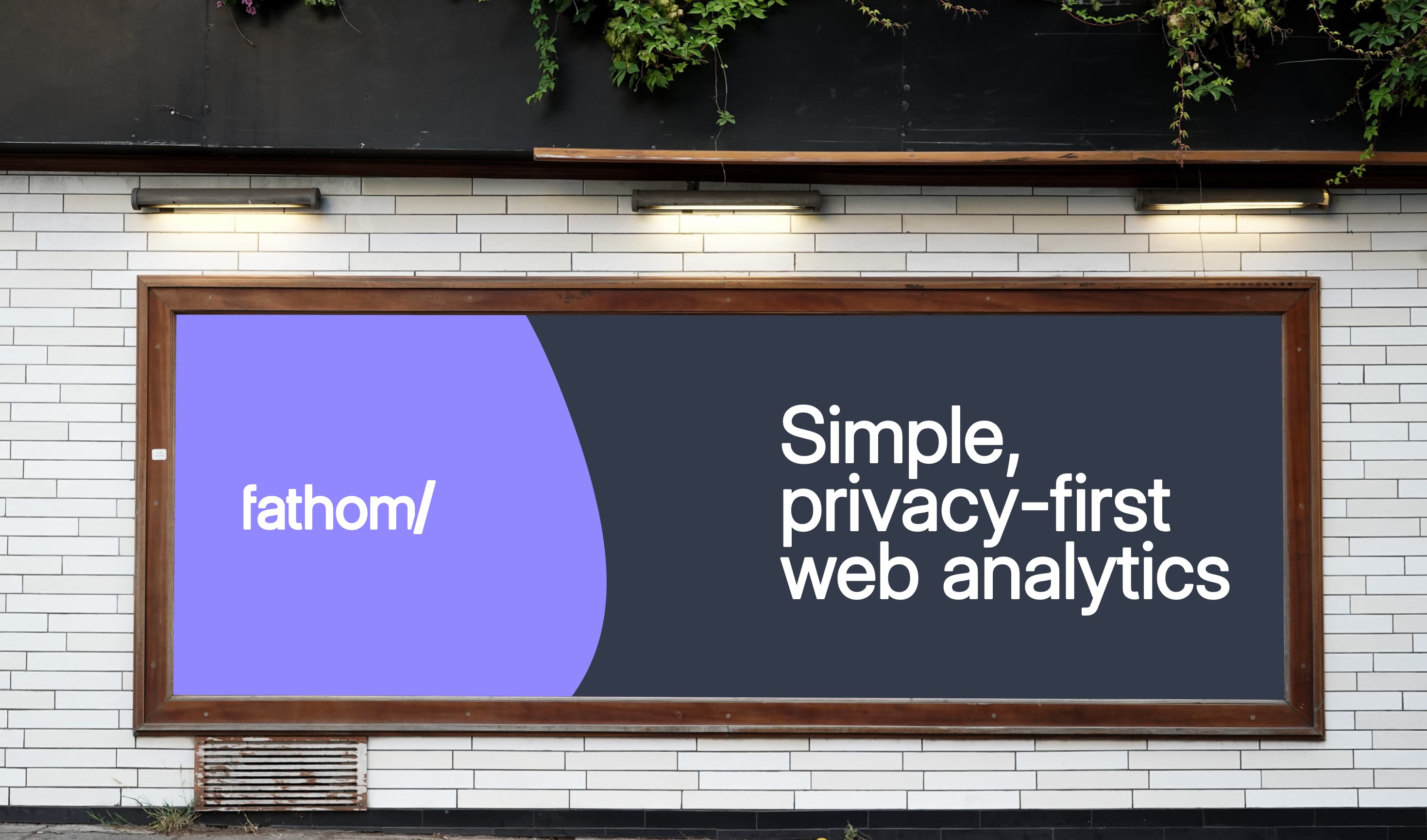
The brick wall, v3
The third and current version of the Fathom logo is what I refer to as “the brick wall”. This came into effect in November of 2020 and I have promised Jack not to change it again for at least several years.
The name and brand mark comes from an unreleased version of an explainer video where our mascot, Luna, was being followed by trackers around the internet. Everything she did, from online shopping, to talking to friends on social, to visiting websites, was being collected and stored about her. This data followed her around most of the internet. Well, it did until she visited a website that used Fathom. Since Fathom doesn’t track people and their tastes across the web, all of the data couldn’t follow her onto a site with Fathom. Hence, Fathom put a “brick wall” between nefarious cross-site trackers and Luna.
So, all of that is to say, I wanted to use a slash in the new logo to embody this core ideal of our company. Our commitment to privacy is the core of what we do and how we do it: we don’t stalk people across the internet for profit. Fathom is a brick wall between big tech’s trackers and the privacy of internet citizens.
I also wanted something very simple, as that’s another very important part of Fathom as a piece of software, so our name with slash doesn’t get much simpler.
The “Analytics” is also dropped from the logo. Yes, we go by “Fathom” or “Fathom Analytics” (never “Use Fathom”… that’s not our name, it’s our URL), but that’s a lot of words on a horizontal plane, so by using 16 characters across, our logo would have to be quite small in most cases, whereas just using 7 characters (“fathom/”) is less than half.
![]()
The typeface is also custom, based off of Inter. I love Inter, but I wanted something slightly friendlier and softer, so I rounded the hard edges slightly (if Rasmus ever releases an “Inter Rounded” I’ll be ALL IN). The palette is also slightly lighter and less “terminal/mainframe bright green” as before.
Yes, those weird cats are here to stay
The story goes (and it’s true), when looking for illustrations for our new company, I found a lot of SaaS used very similar, simple human drawings. Which is fine. They’re widely accepted and give off a comfortable and familiar vibe. But part of Fathom’s brand is a weird quirkiness and I really wanted the artwork that went with our site to communicate that.
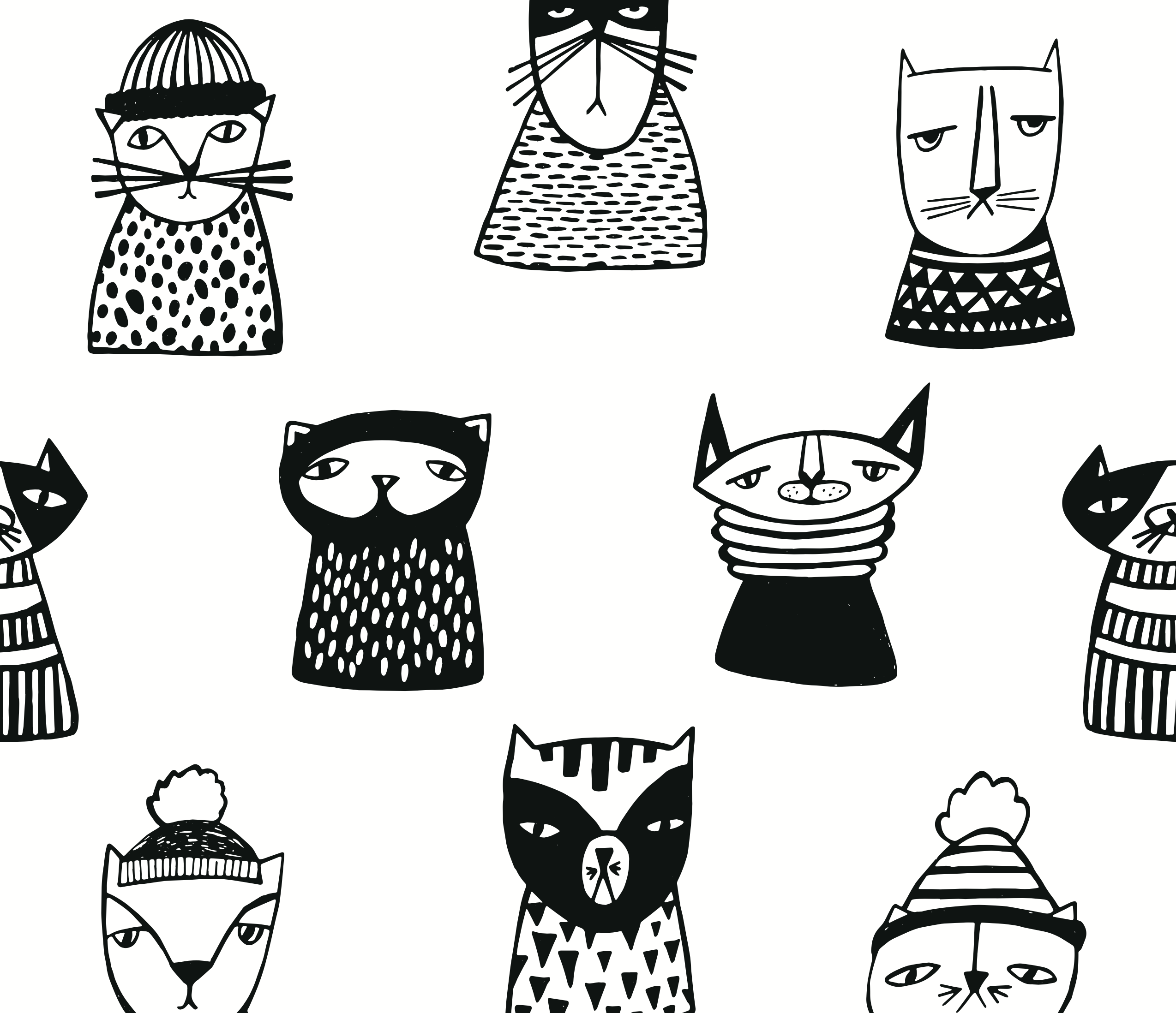
Yes, I could have gone with rats or dogs or emus, but I found a royalty-free set of ugly cat drawings with scarves that I could not resist. And from then on, our brand is forever tied to weirdo cats with clothing.
Version one of the cats were, as I said, a purchased royalty-free group of drawings that I tweaked slightly and used on our site for many months. Version two we hired a talented illustrator to do some custom peculiar cats for us, which we also used for many months.
For the current version I drew them myself. I know I’m not the best illustrator, but I also knew I wanted drawings that were both odd and uniform (if that’s possible) and worked at it until I had them just right.
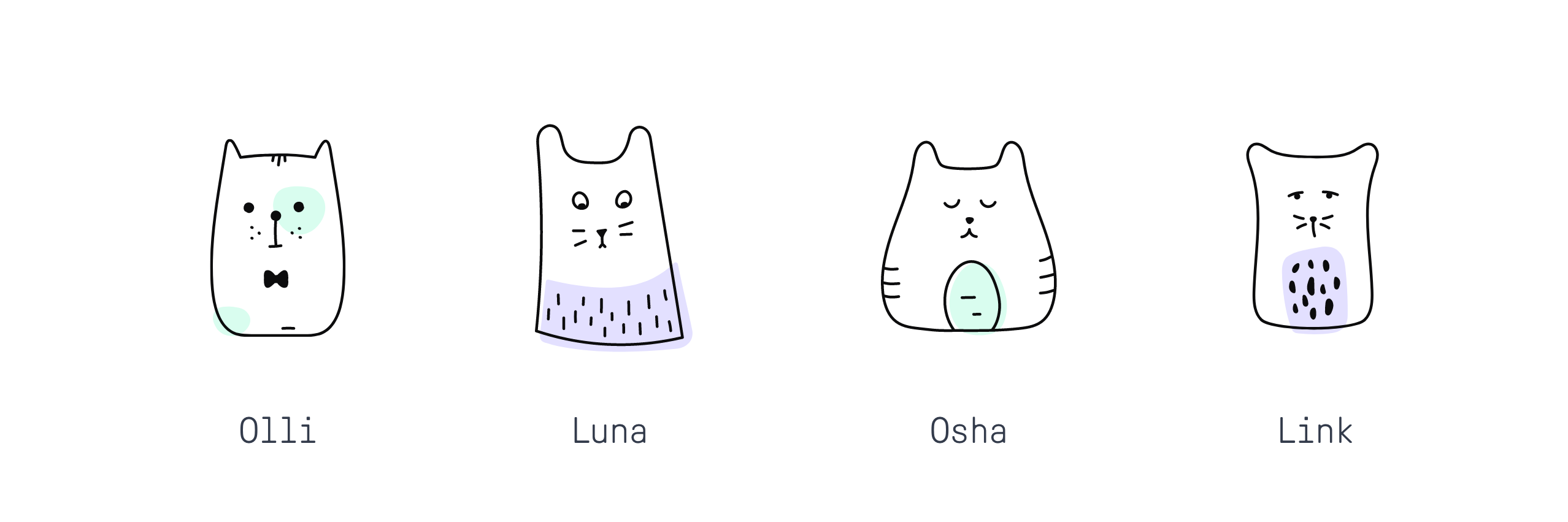
These new/current drawings have stroke-weights, curves, colours, and details that are completely consistent with each other. They’re also much lighter than previous versions (no more thick black colourings or lines) to give them a weightless feeling… since most of the time they float on the page.
They’re also only vaguely cats, since we’re a privacy-first software company, not a pet food business. So they represent more of our personality than something specifically feline.
Because we had created a story around “Luna” (found in our explainer video), we felt like they could have all names, so I named them based on pets I’ve had over the years and each drawing has a characteristic of that specific pets personality.
Our brand has values
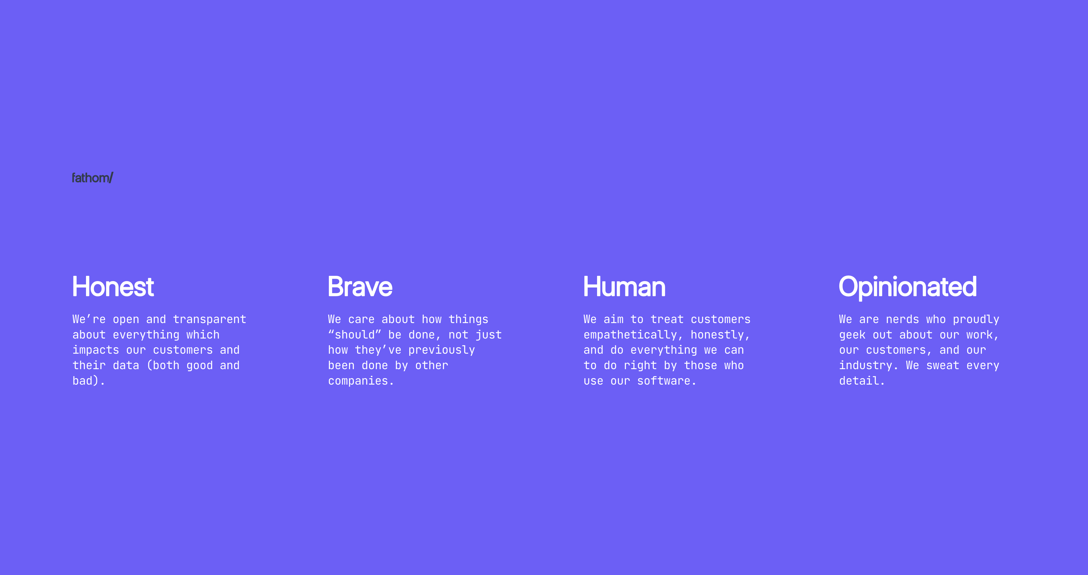
As I mentioned, a brand is more than just fonts, drawings and colours, it’s how it makes someone feel when they interact with it. And so before designing anything, I came up with some succinct definitions about what’s important to our company. And then from there, the design rules would be built off those values.
- Honest: We’re open and transparent about everything which impacts our customers and their data (both good and bad).
- Brave: We care about how things “should” be done, not just how they’ve previously been done by other companies.
- Humane: We aim to treat customers empathetically, honestly, and do everything we can to do right by those who use our software.
- Opinionated: We are nerds who sweat every detail and proudly geek out about our work, our customers, and our industry.
These ideals don’t just inform visuals, but inform everything about our company. Whether it’s being proud of the simplicity of our interface, or sending a tough email to customers about a DDoS attack, how we show up for the people who pay us and the rest of the world is important and should be consistent. Not just when it’s showing up, but also when we’re acknowledging flaws.
Welcome to Fathom Analytics, now with 103.8% more consistent branding
We hope you enjoy these subtle changes to our design language we’ve introduced, and continue to introduce you to as we roll out new features.
Because of all of this work, it’s now much easier to get graphic and content work done on “new” things (like V3 of our software or even just new blog posts) because a lot of decisions around the UI have been made. If we were to do things like billboards, well, we know what they’d look like now too.
Writing a story about Fathom? You can download our brand assets here.

BIO
Paul Jarvis, author + designer
Recent blog posts
Tired of how time consuming and complex Google Analytics can be? Try Fathom Analytics: